Fare is a multi cuisine restaurant with numerous online and walk in users with topnotch chefs including the owner. Fare is budget friendly restaurant most of targeted audience are professionals business owners and college student.
Design a mobile Food Delivery App for drivers, owners and end users
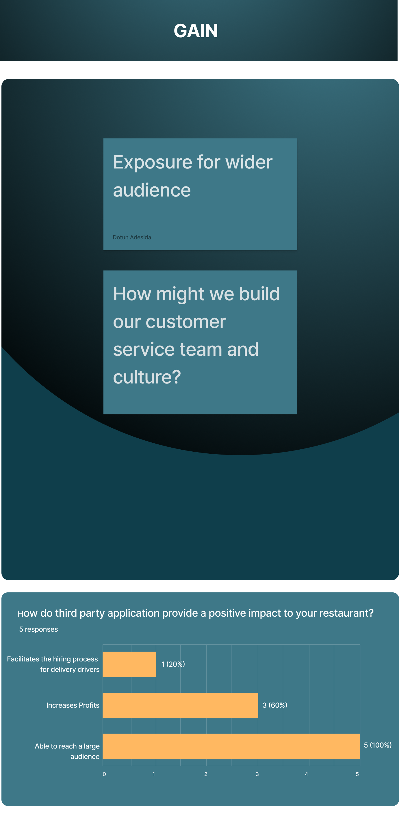
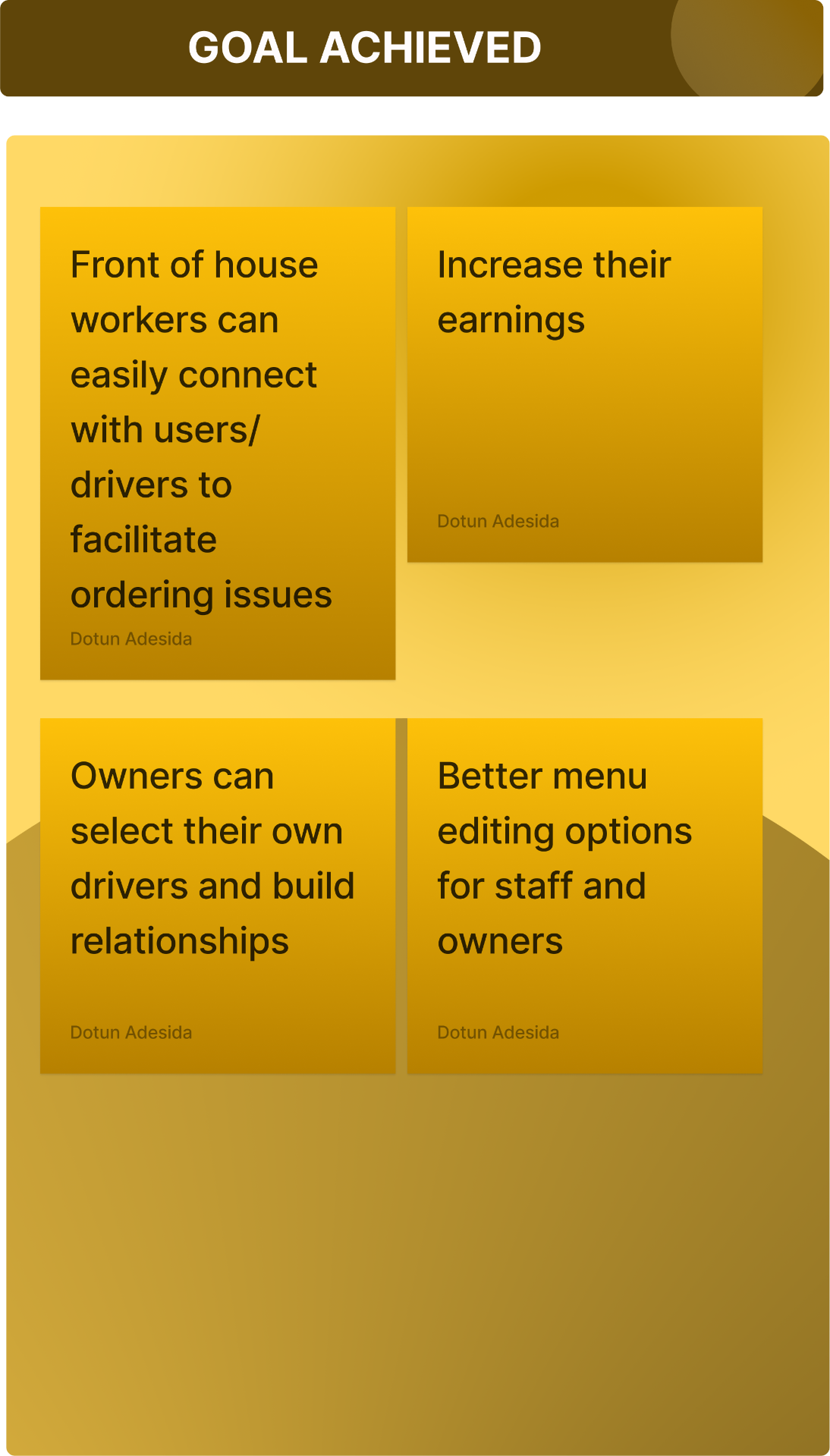
To Create an experience for ends users, owners convenient way to view, monitor, and choose their preferred drivers
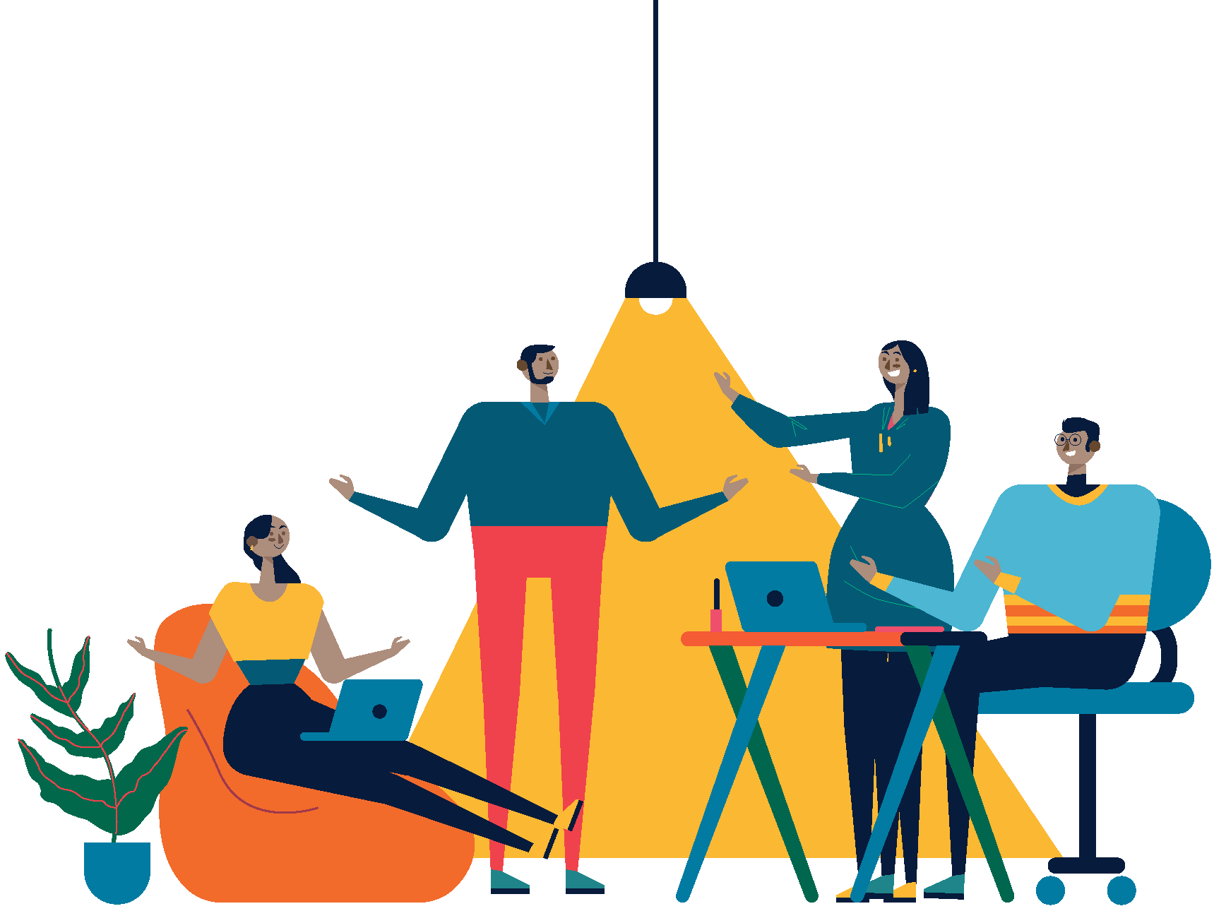
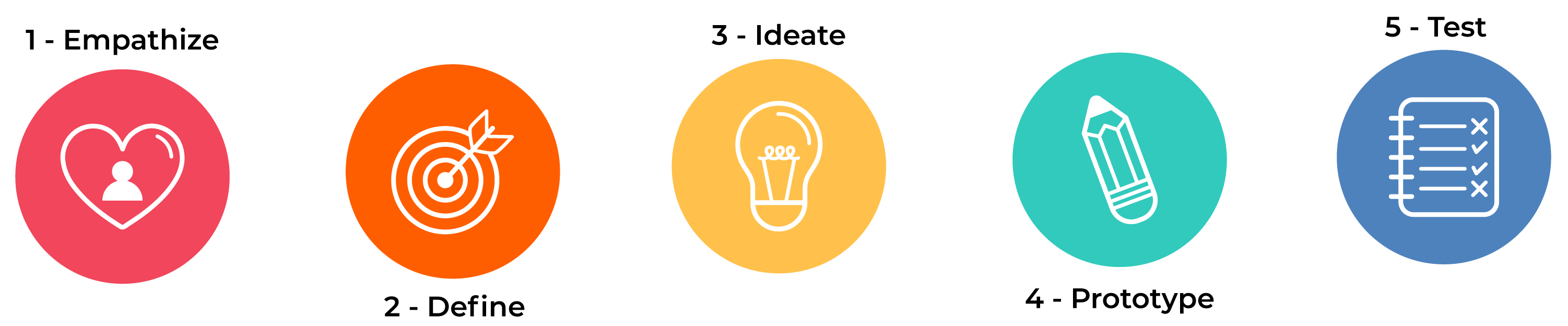
In this group project, we embarked on a UX case study to improve food delivery. We listed our certainties, suppositions, and doubts, brainstormed ideas, and used a lean survey canvas to create targeted questions. Dividing into teams, we explored the perspectives of restaurants and end users. Focusing on the restaurant owner's viewpoint, we refined the problem statement and identified research objectives. By gathering data, analyzing insights, and collaborating, we generated valuable recommendations to enhance the food delivery experience for all stakeholders involved.
We started by consolidating on the individual ideas or data point which was written on a sticky note.
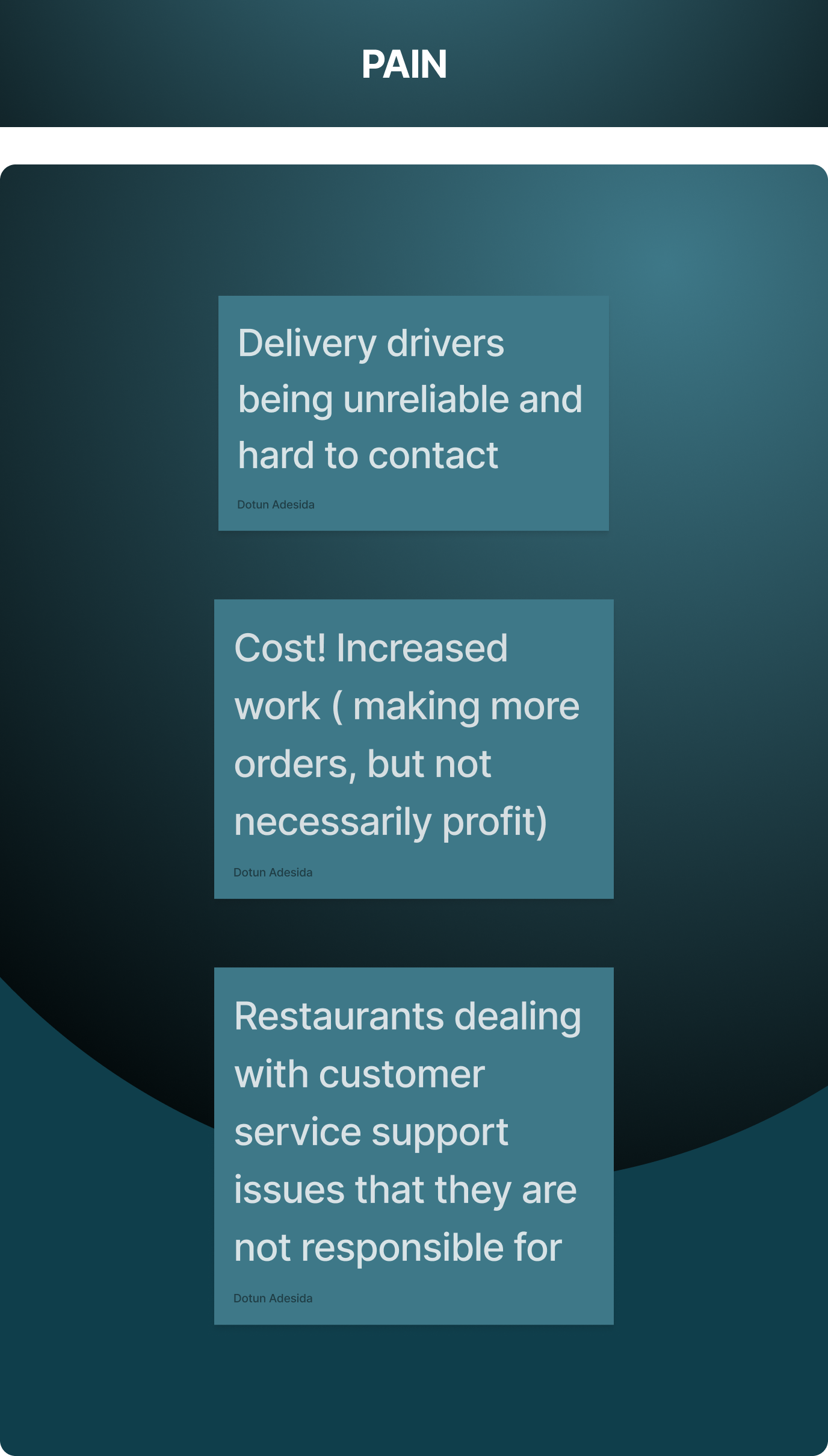
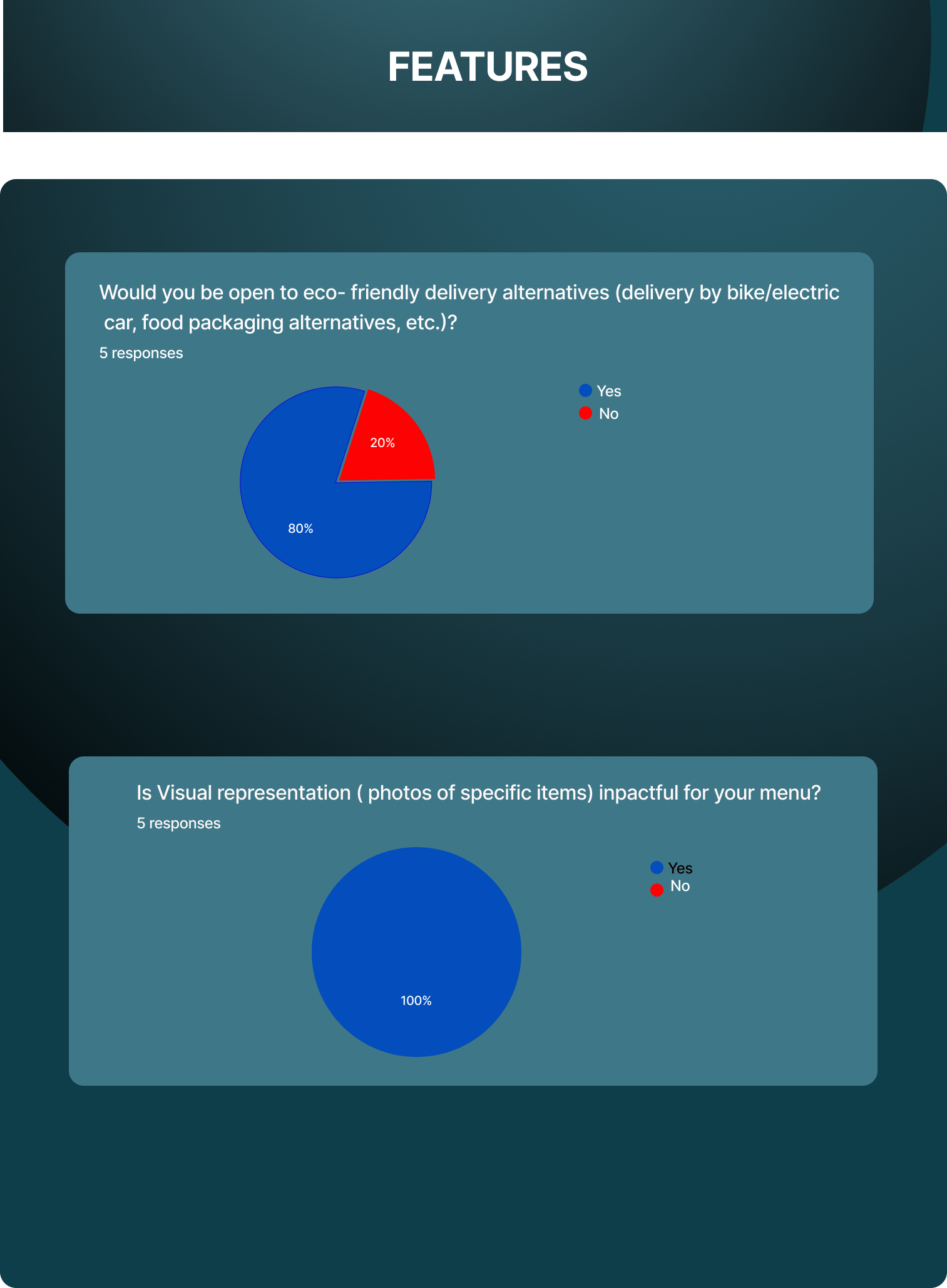
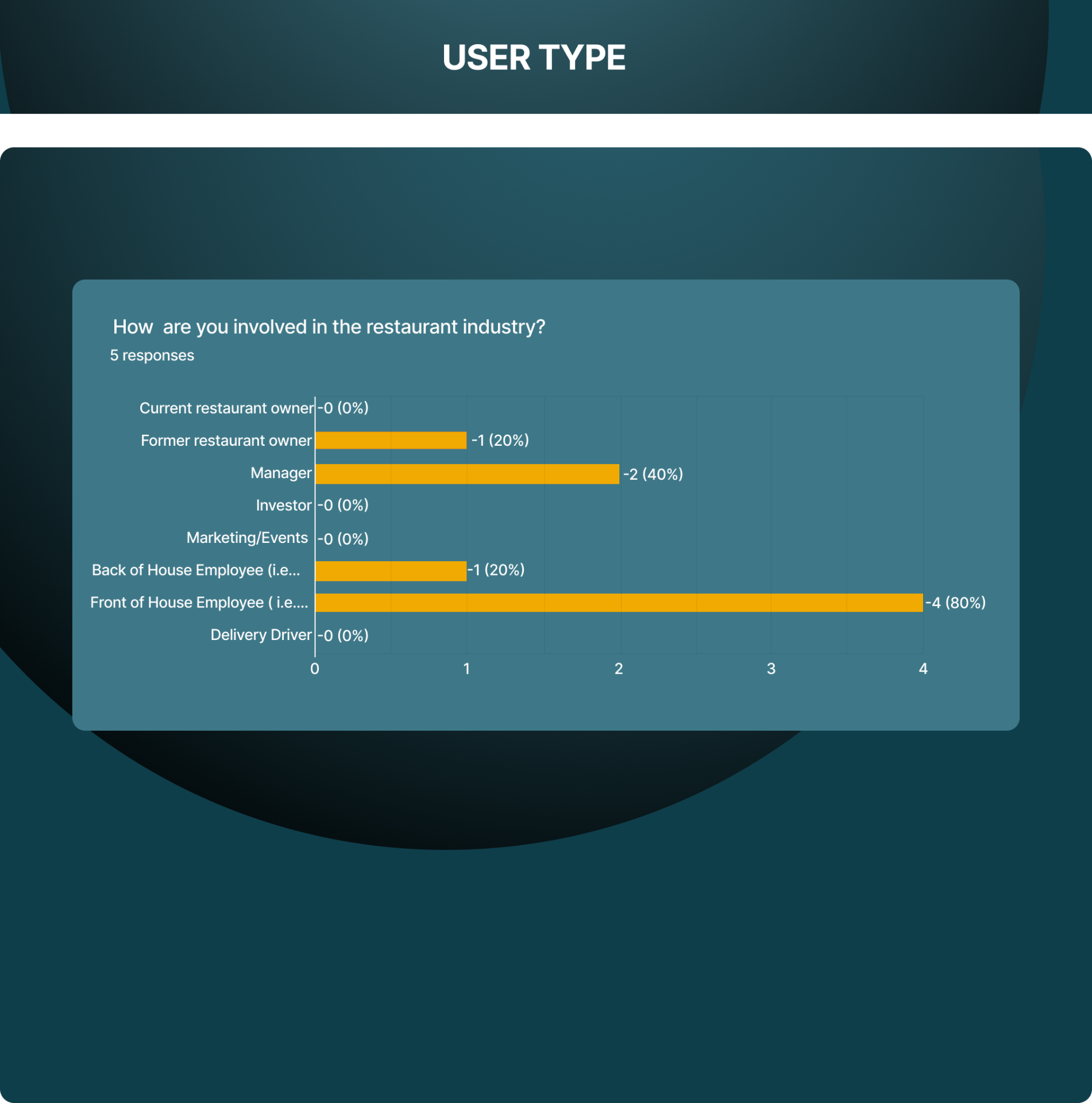
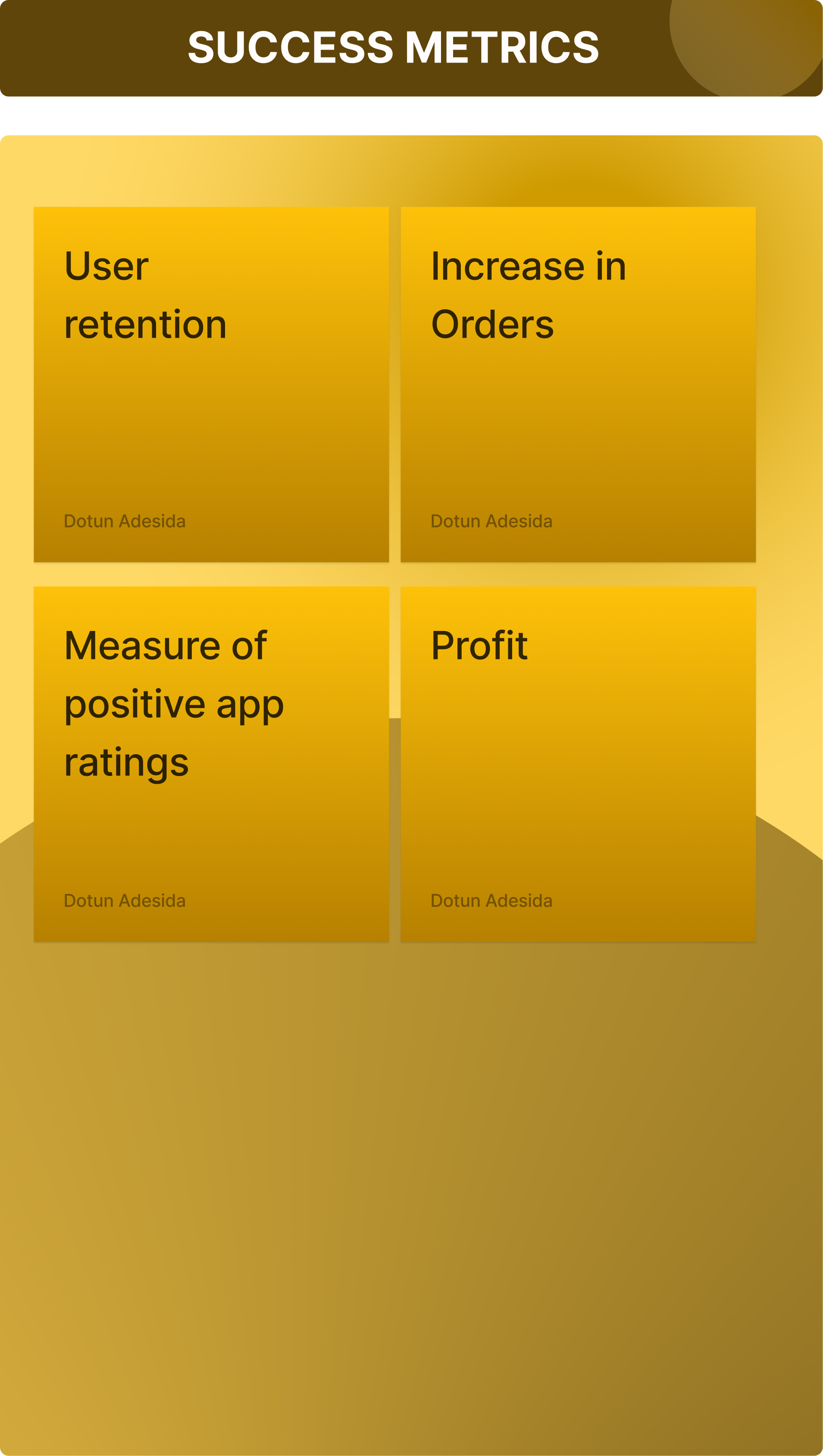
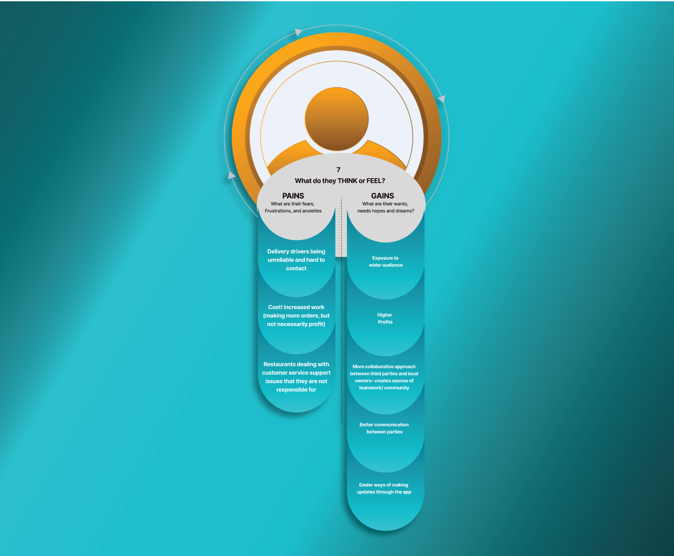
We deliberated on the Gains, Pains Features and user types
In pellent After finalizing our affinity Diagram, we turned to our HMW (How Might We) statements. We collaborated on potential problems we might solve in relation to the data we received.
Two statements we created were:
How Might We:-
-create a better experience for everyone involved in food delivery services?
-create better feedback systems between users and business owners?
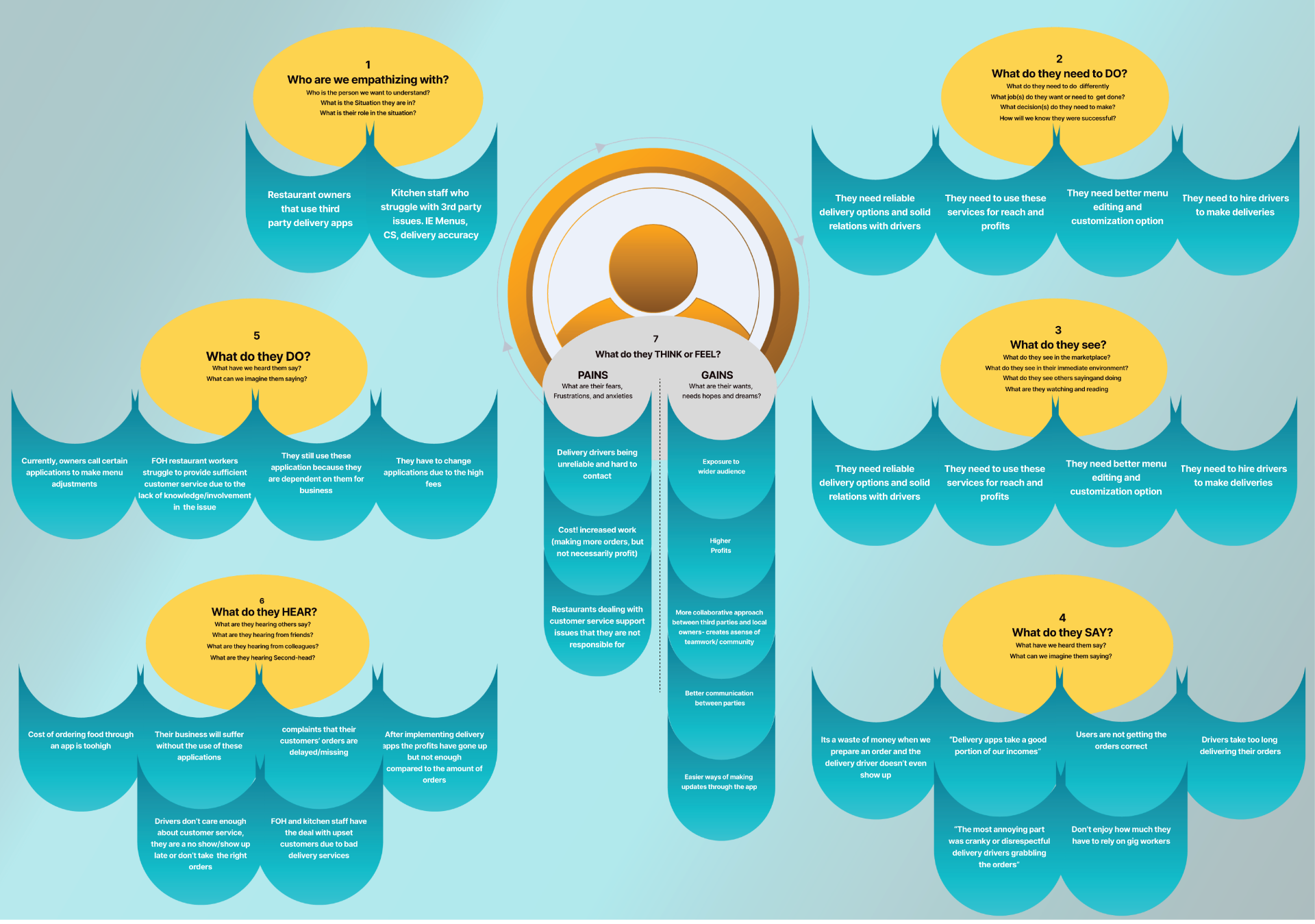
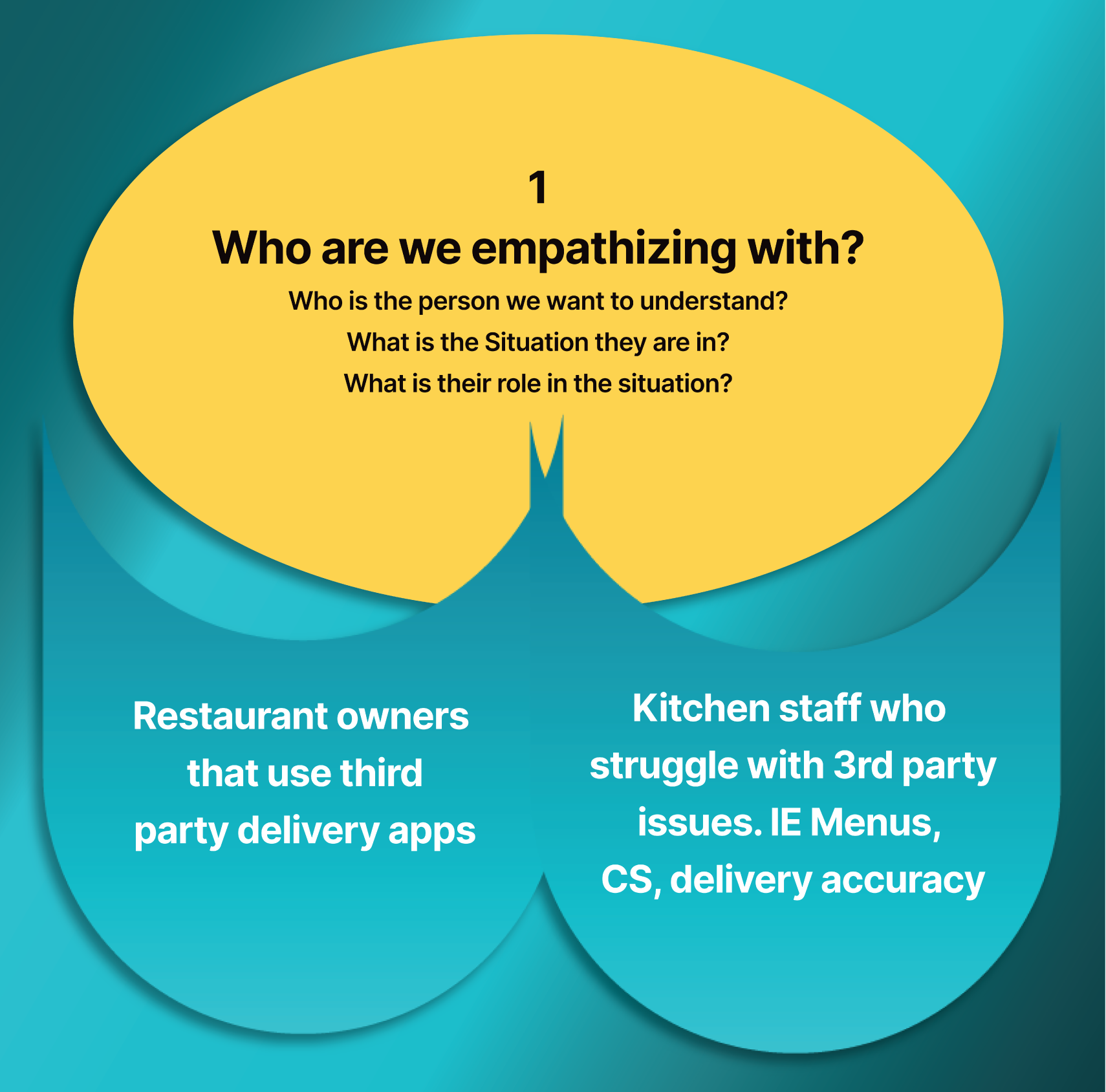
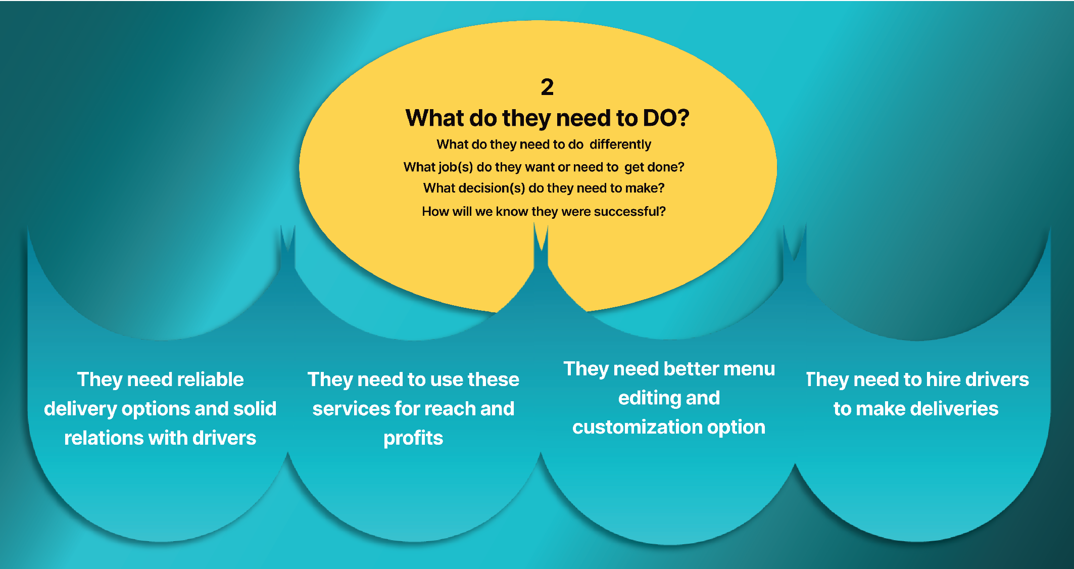
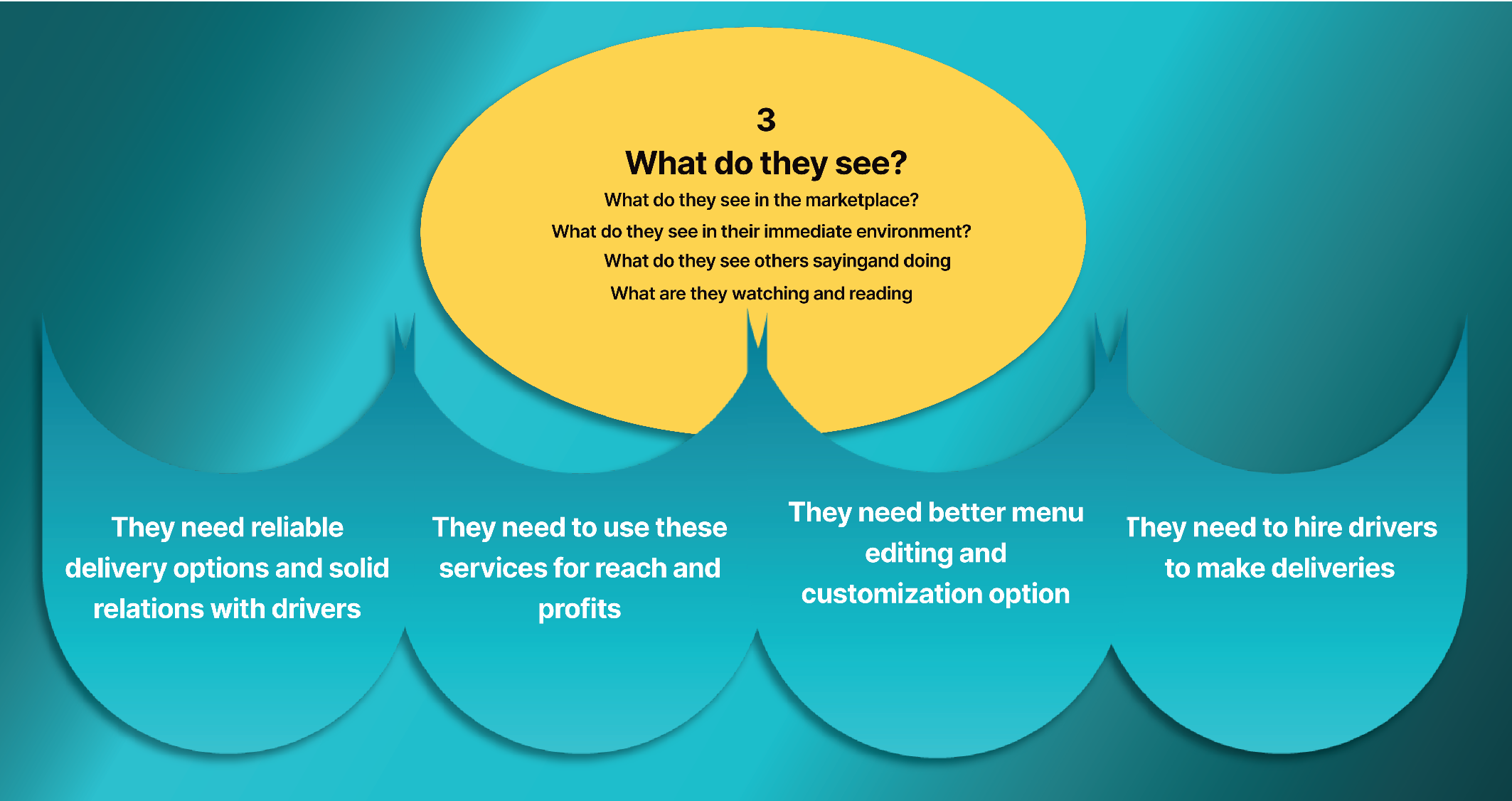
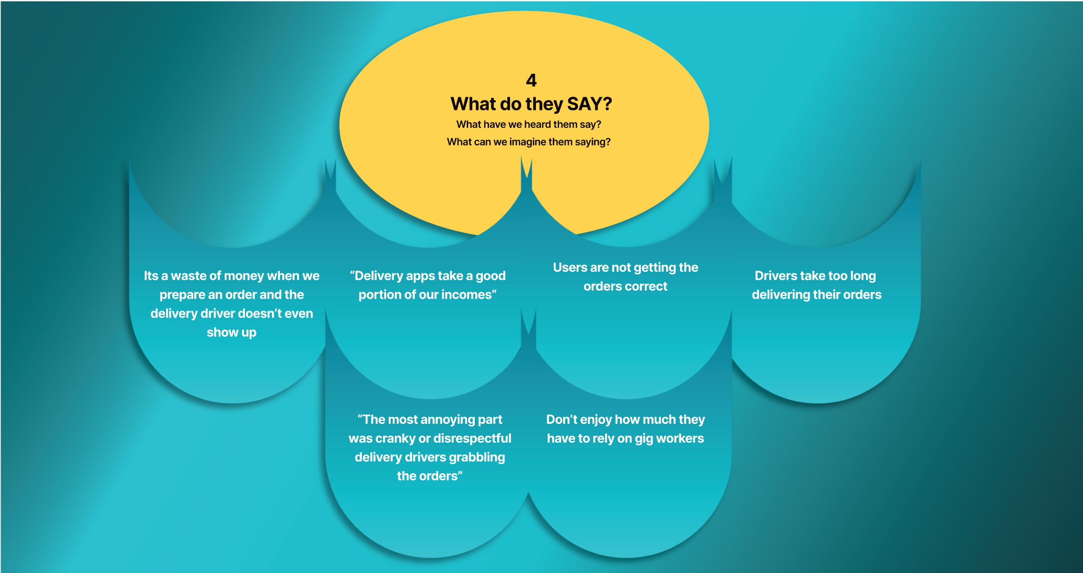
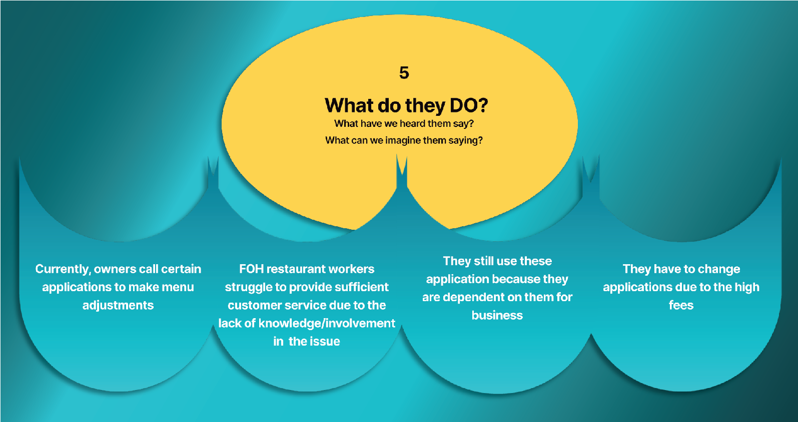
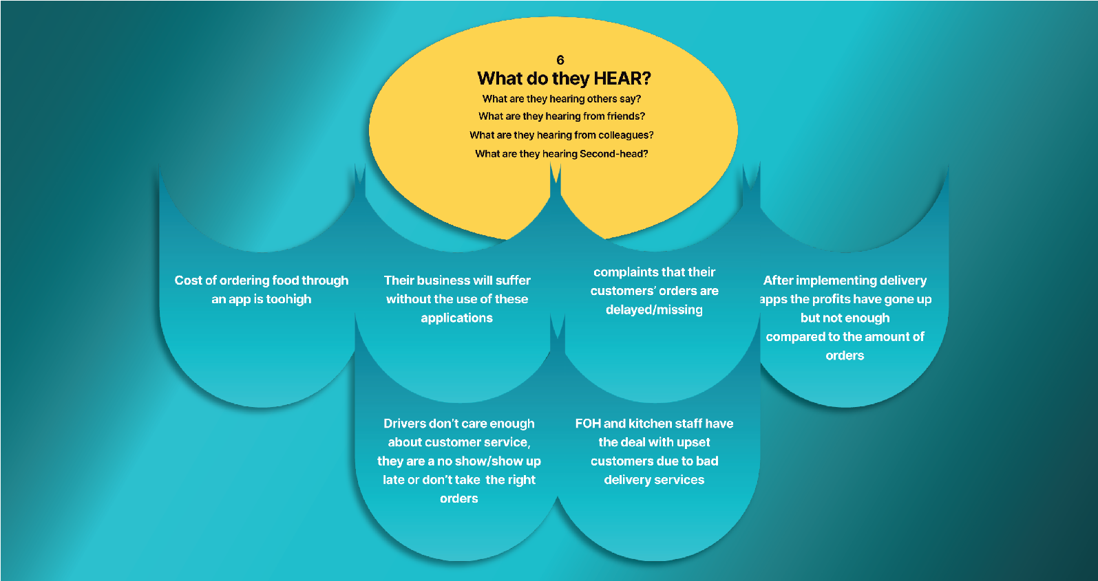
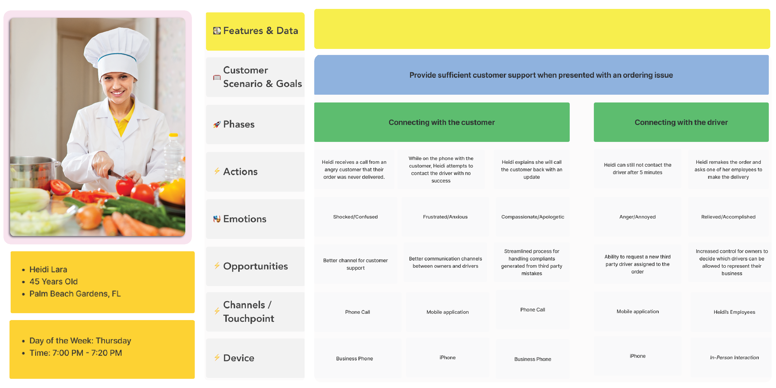
In order to get a deeper understanding about Owner, driver and user behaviors and decisions, we used The empathy map, is a collaborative visualization to articulate what we know about a particular type of owners. It externalizes knowledge about the owner.
(a) in order to create a shared
Understanding of the owner's needs, and
(b) Aid in decision making
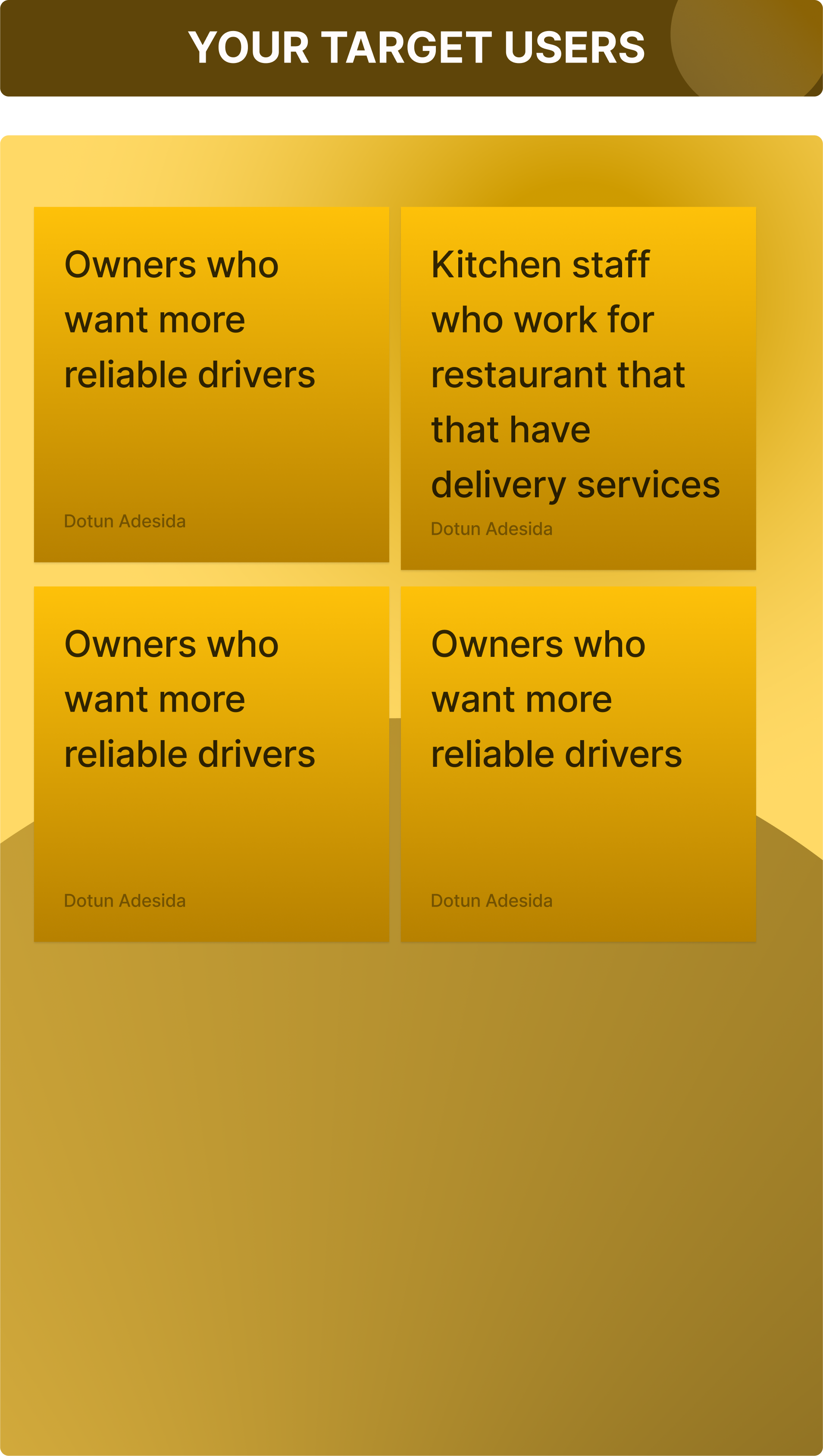
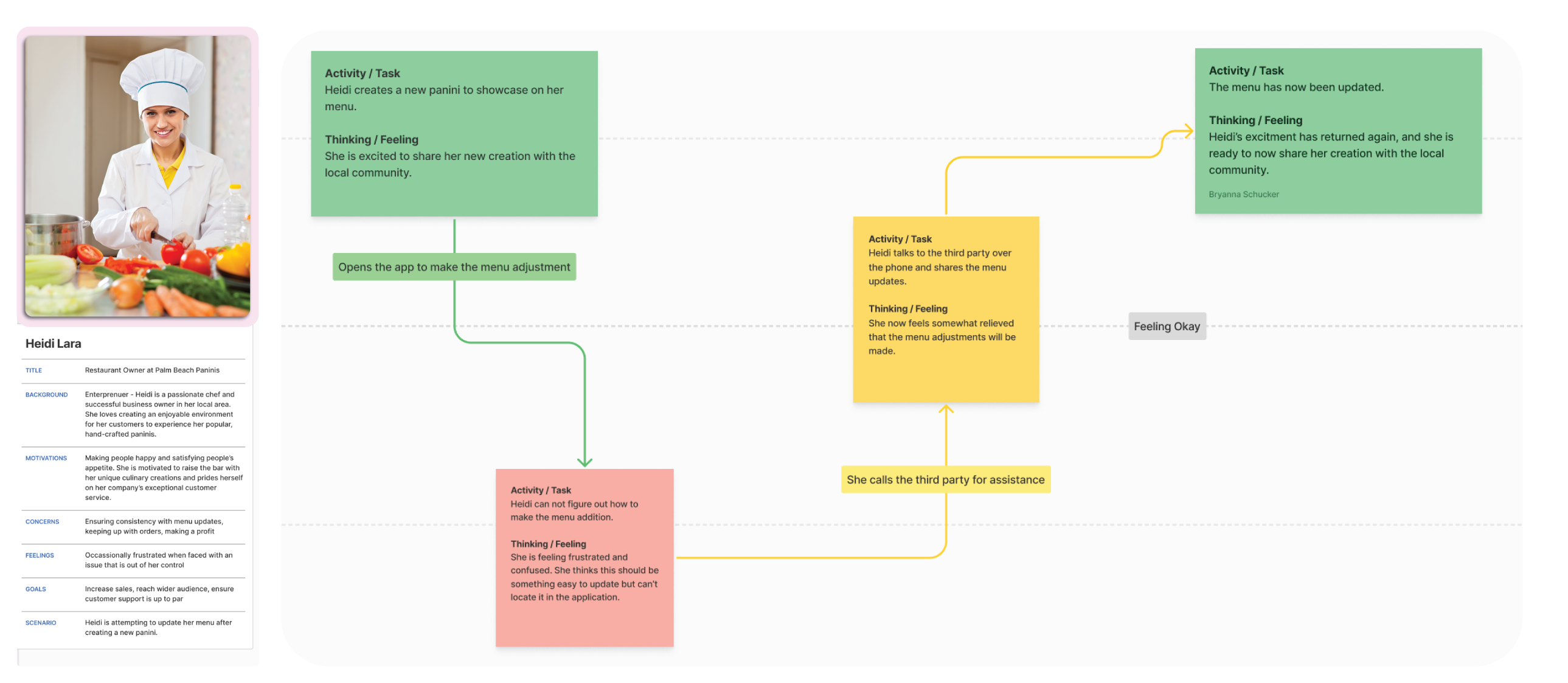
With the help of empathy map we were able to create the user persona based on the information we gathered through our research. We started to outline who these individuals may be (age, profession, location, frustrations/wants).
We then created mood boards that captures the mood of the the Restaurant owner Drivers and the end users.
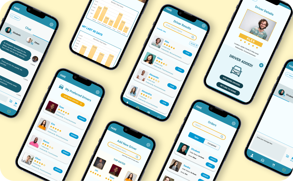
Before we started working on our prototypes in Figma, we focused on organizing, structuring, and labelling content in an effective and sustainable way
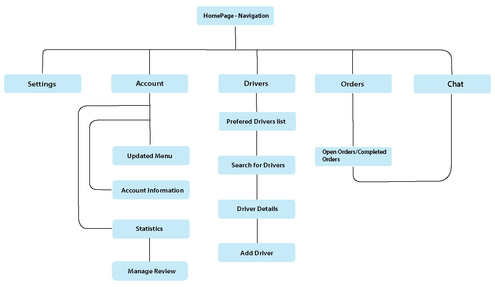
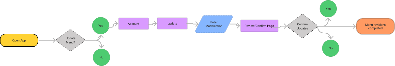
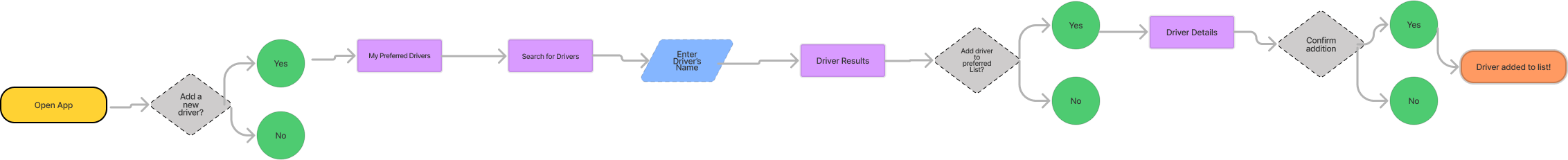
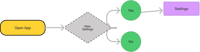
The user flow is a process which begins from the entry point through a set of steps towards a successful outcome and final action. User Flow started with the;
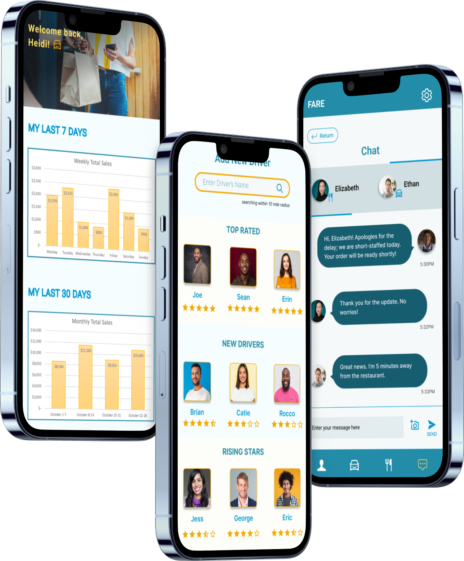
Updated Menu, Checking order status/Accessing chat, Adding New Drivers, View statistic/ Manager reviews, Updating payment details, View Account Details
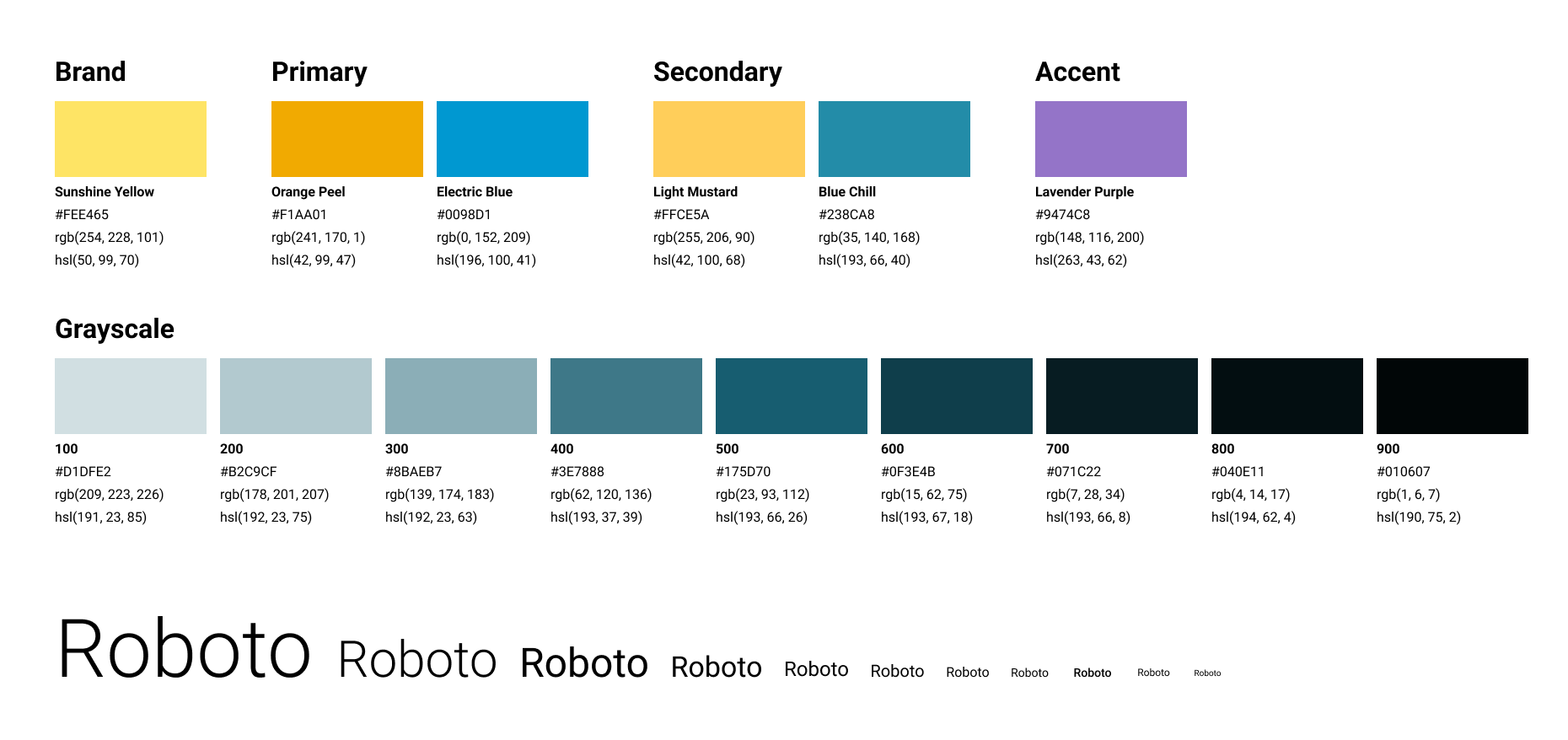
After the Creation of the mood-board, which entales the creation of color pallet, Typography, Iconography, layout, and other design element to ensure a cohesive and user-friendly experience
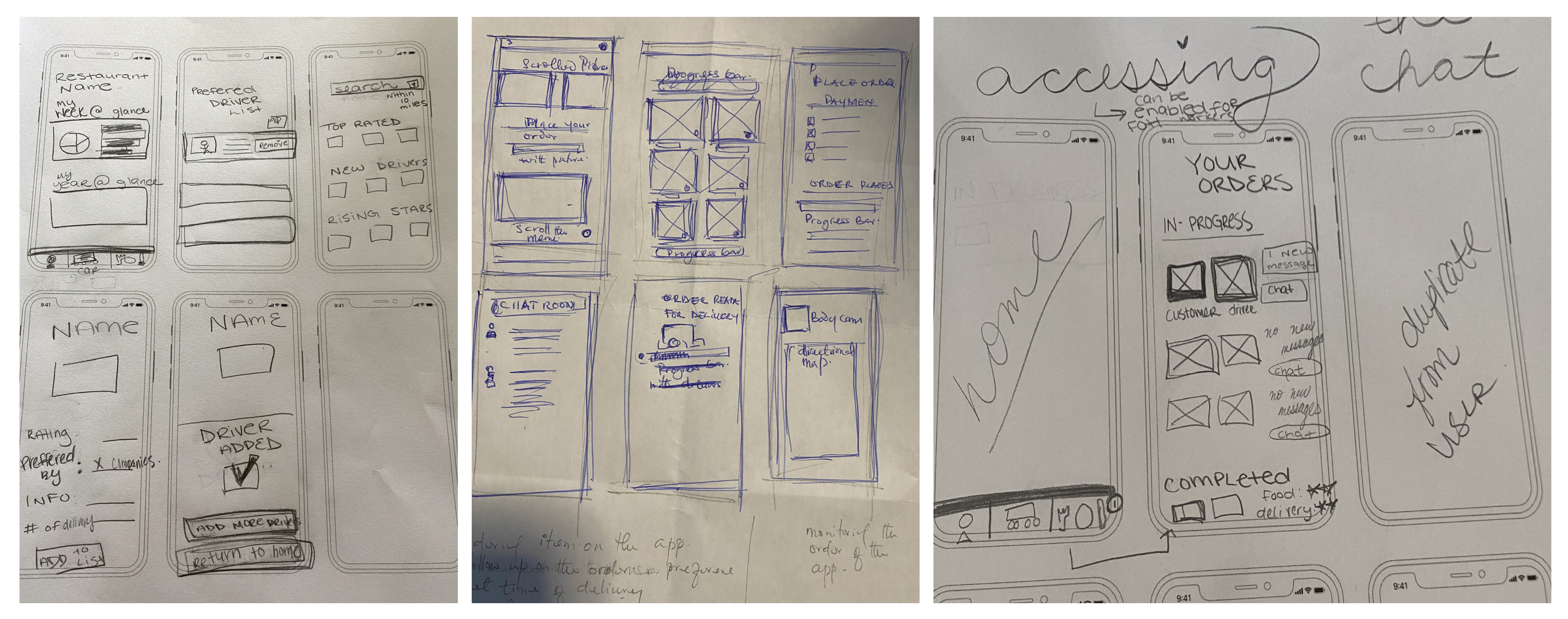
At this point, we created. our lo-fi designs which is basically the use of simplified, rough, andbasic representation of prototype for the restaurant owners, Drivers and end users.
After this we conducted a slight user test in which got some feedback
we moved into the mid-fidelity designs which shows all the details of the pages, and also incorporated the feed back we got from the user testing we did on lo-fi. which is indicated with red dotted lines on the visual
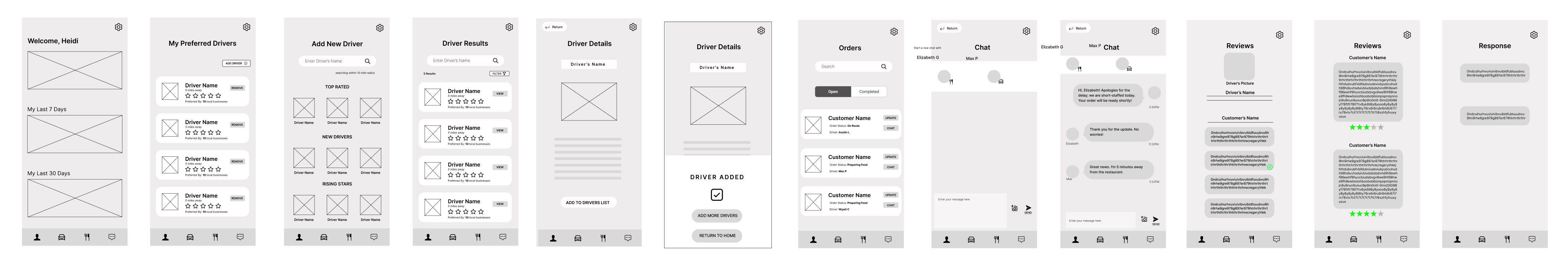
The user testing conducted on the lo-fidelity prototypes yielded three slides with dotted lines representing the key findings and observations.
At this point we delve into polishing the lo-fi and Hi-Fi by incorporating the highly detailed representation of interface that closely resemble the final product
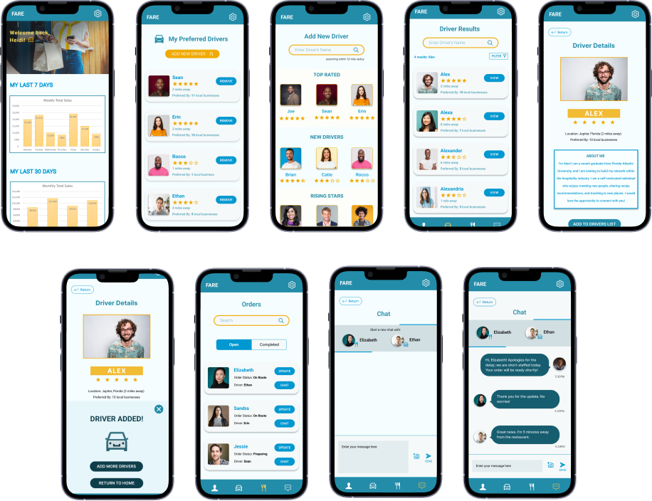
This is a pure static representation of the interface that demonstrate the visual design and layout, which basically showcases how the elements are prodigious utilised with a touch of aesthetics