Create a transformative e-learning website platform that empowers individuals to take control of their learning journey, fostering a lifelong passion for knowledge acquisition and personal growth.
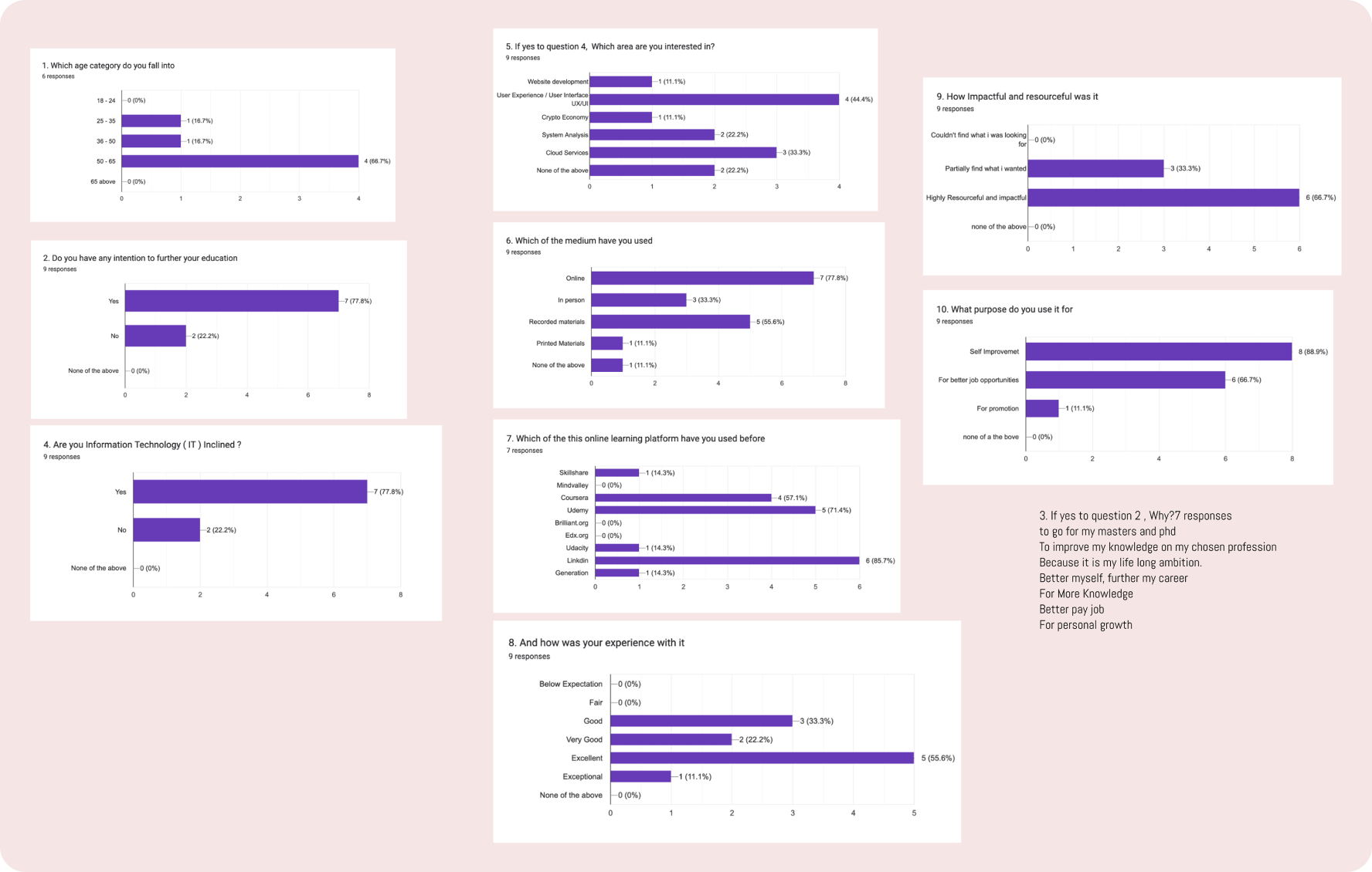
After about Twenty Eighty hours, responses to the surveys started trooping in, eventually I was able to collate ten surveys considering the time I have to work on this project. The survey were tabulated in there categories some of the questions are, The agescategories, Any intention to engaged in the TechIndustry, Do they have ambition to further their education, Have they ever been engaged in any E-Learning platform and if yes which one of it to specify, how was their experience with such platforms.
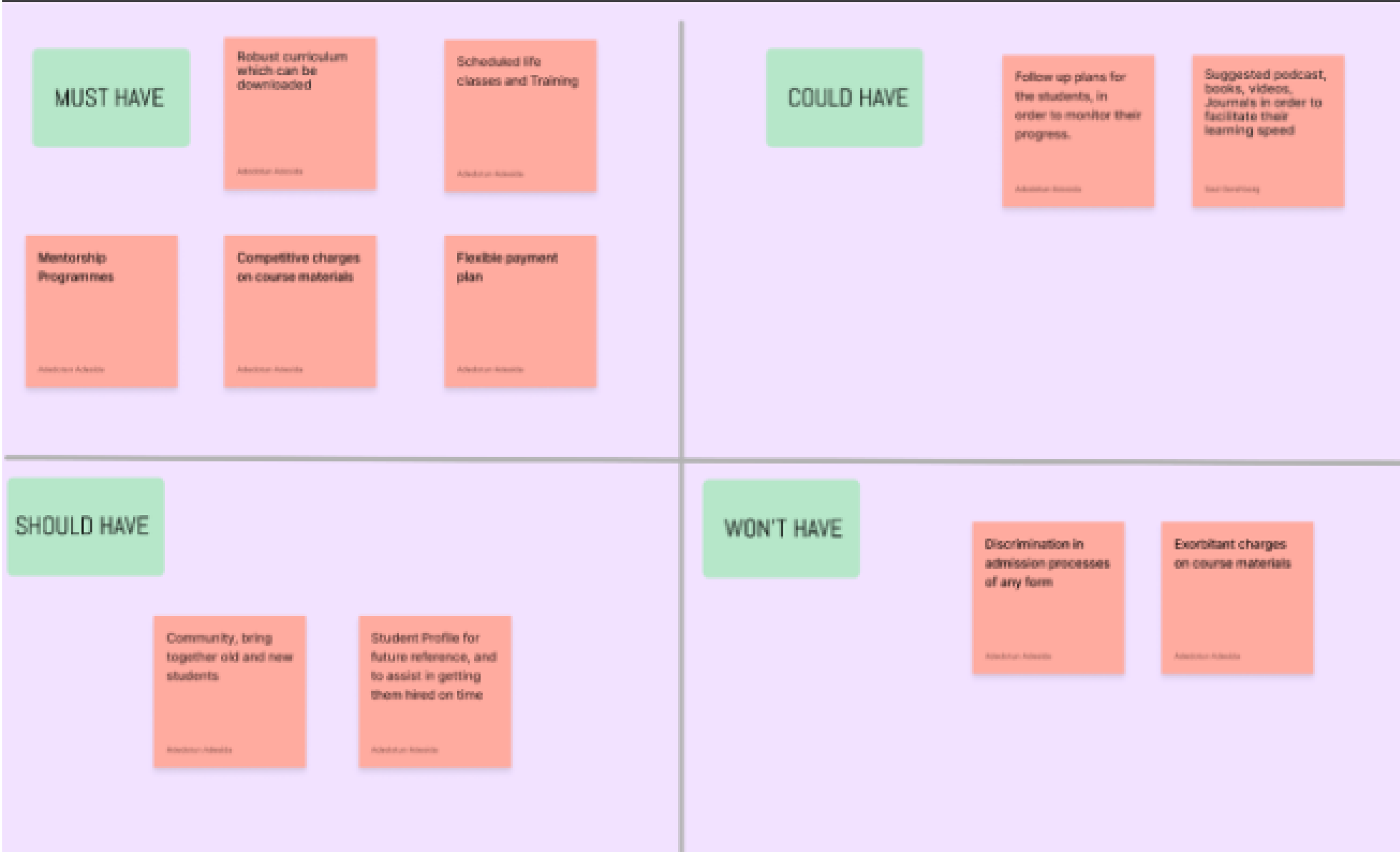
From these analysis i was able extract the necessary information for my Affinity Diagram,Empathy map, user persona, Journey mapping, and Moscow methods.
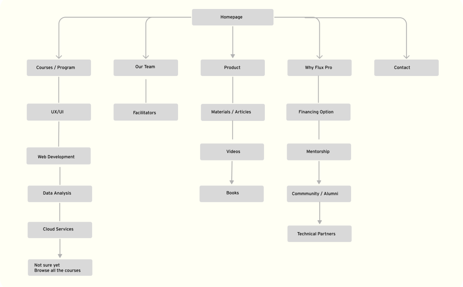
The App has been in existence for a while but went on a break for almost two years, in the process of the short break there was a change in management who decided to revamp and rebrand the App in totality. The purpose is to develop an experience for an existing and upcoming users, For Incoming users, is to create an experience that we reassure them of quality services they were already use to, For the new users is to create an experience where there they will be able to register, search for courses, Tech materials, other informative and educative tools easily.
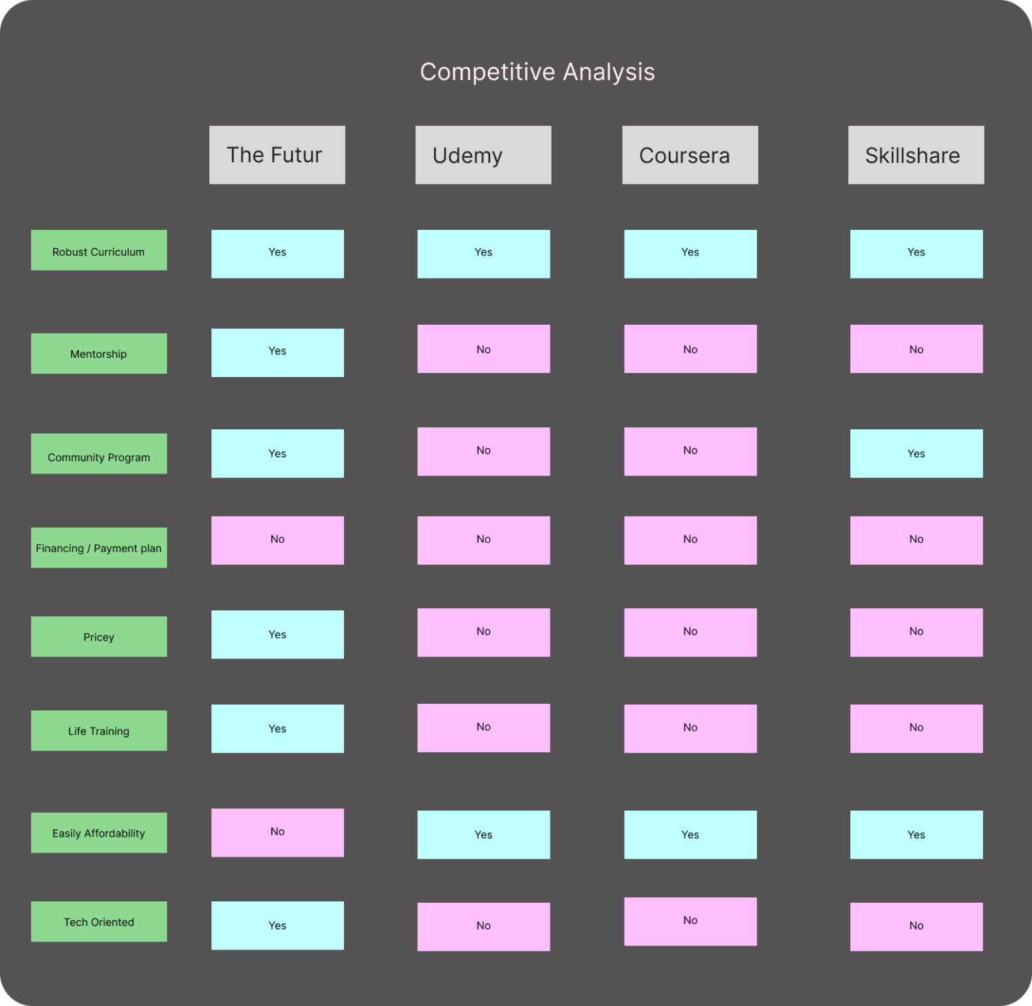
I was able to draw up some creative analysis 0f existing platform like The Futur, Udemy, Coursera, and Skillshire highlighted their strengths, areas for improvement, and potential opportunities for the e-learning platform. By using the Affinity Diagram, I can organize and prioritize these findings, ensuringa competitive edge. This analysis will guide the next stage of development, allowing me to incorporate unique features and enhance the user experience.
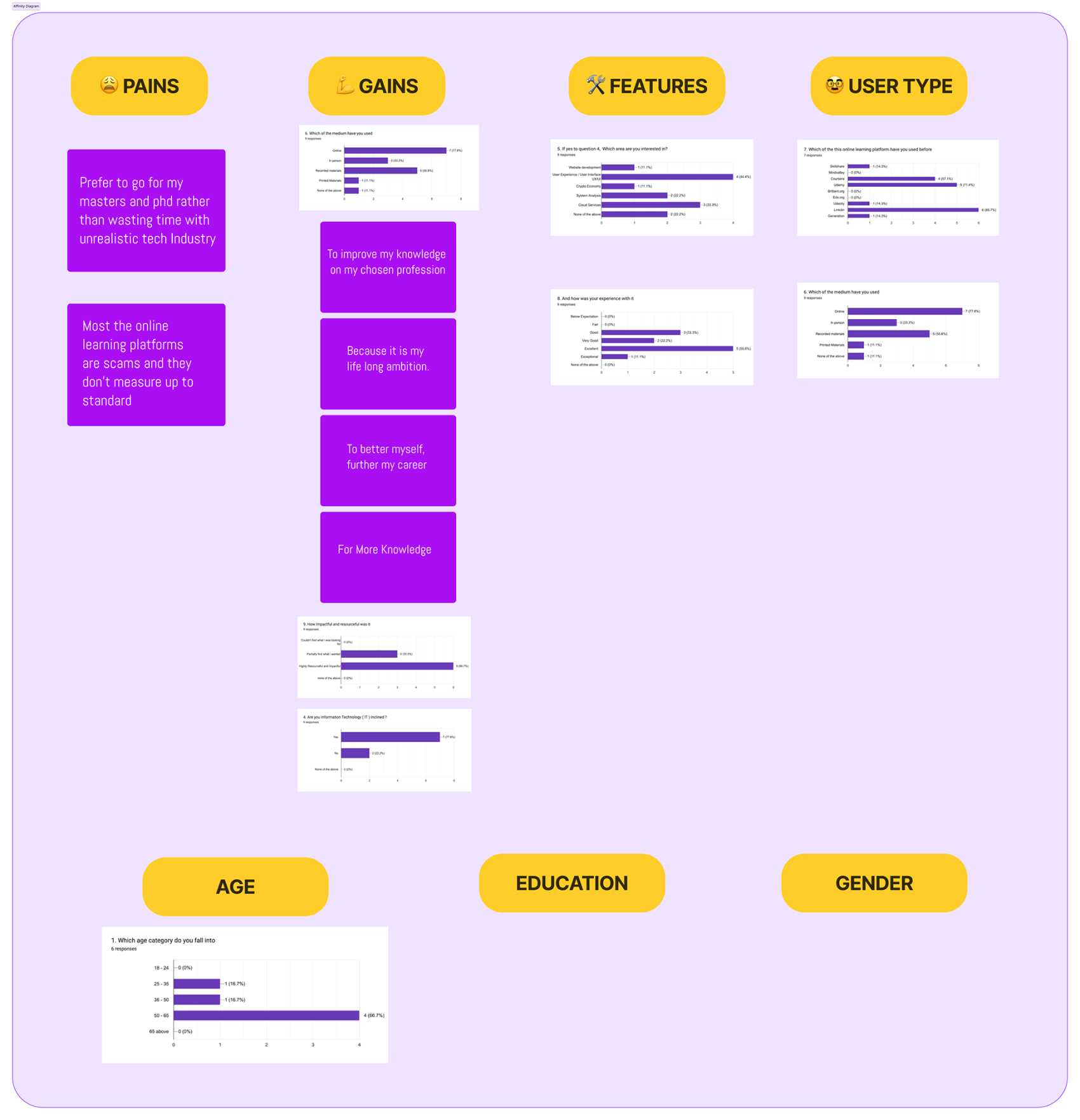
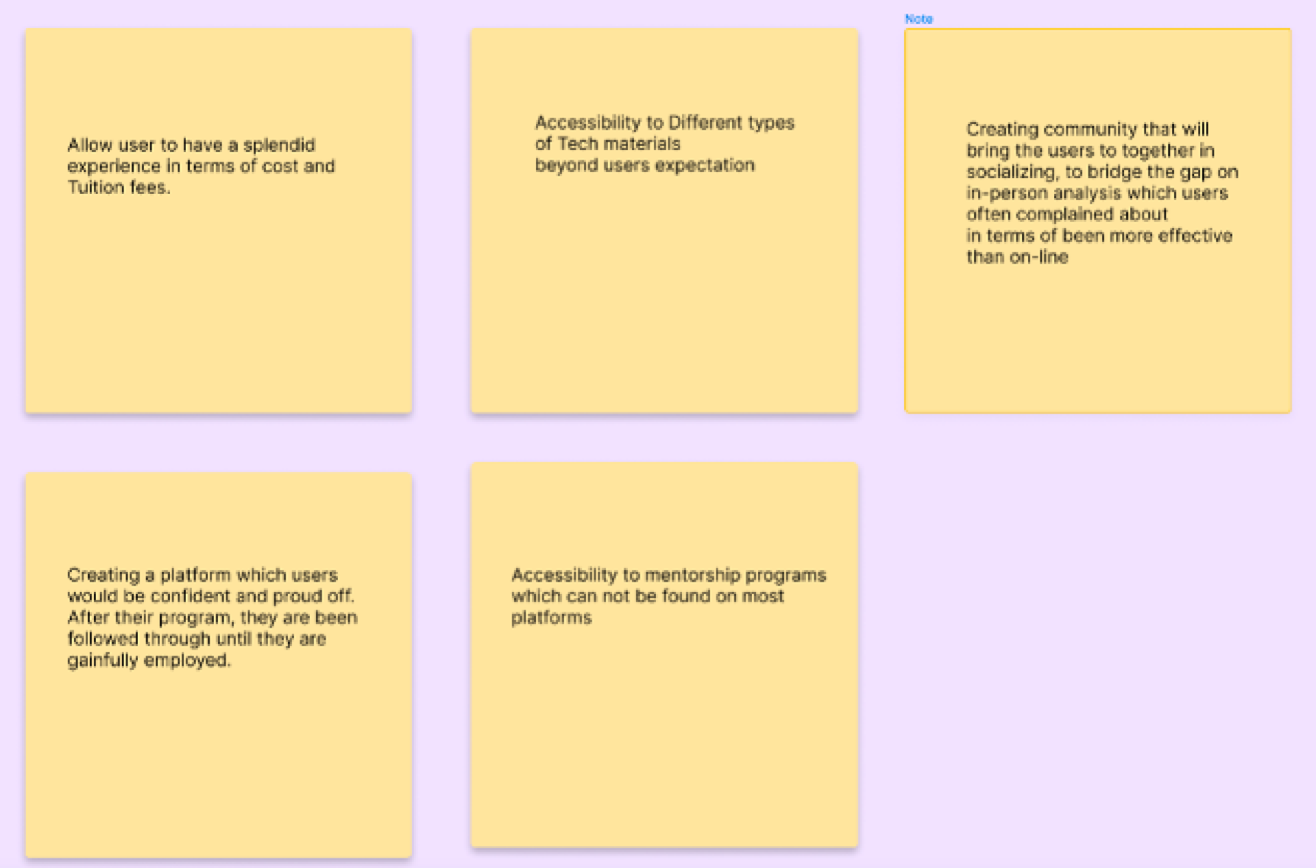
After a critical analysis of the information extracted from the survey, I brake them into there fitted categories, The pains, which are basically the hindrances, The Gain which is the benefit of the program and how impactful it is, The Features, The User type, Age, Education and Gender
-Most of the online learning platforms are scams and they don’t measure up to standard
-Prefer to go for my masters and Phd rather than wasting time with unrealistic tech Industry
-To Improve my knowledge in my chosen field
-Because it is my long ambition
-To better myself, further my career
-For more knowledge
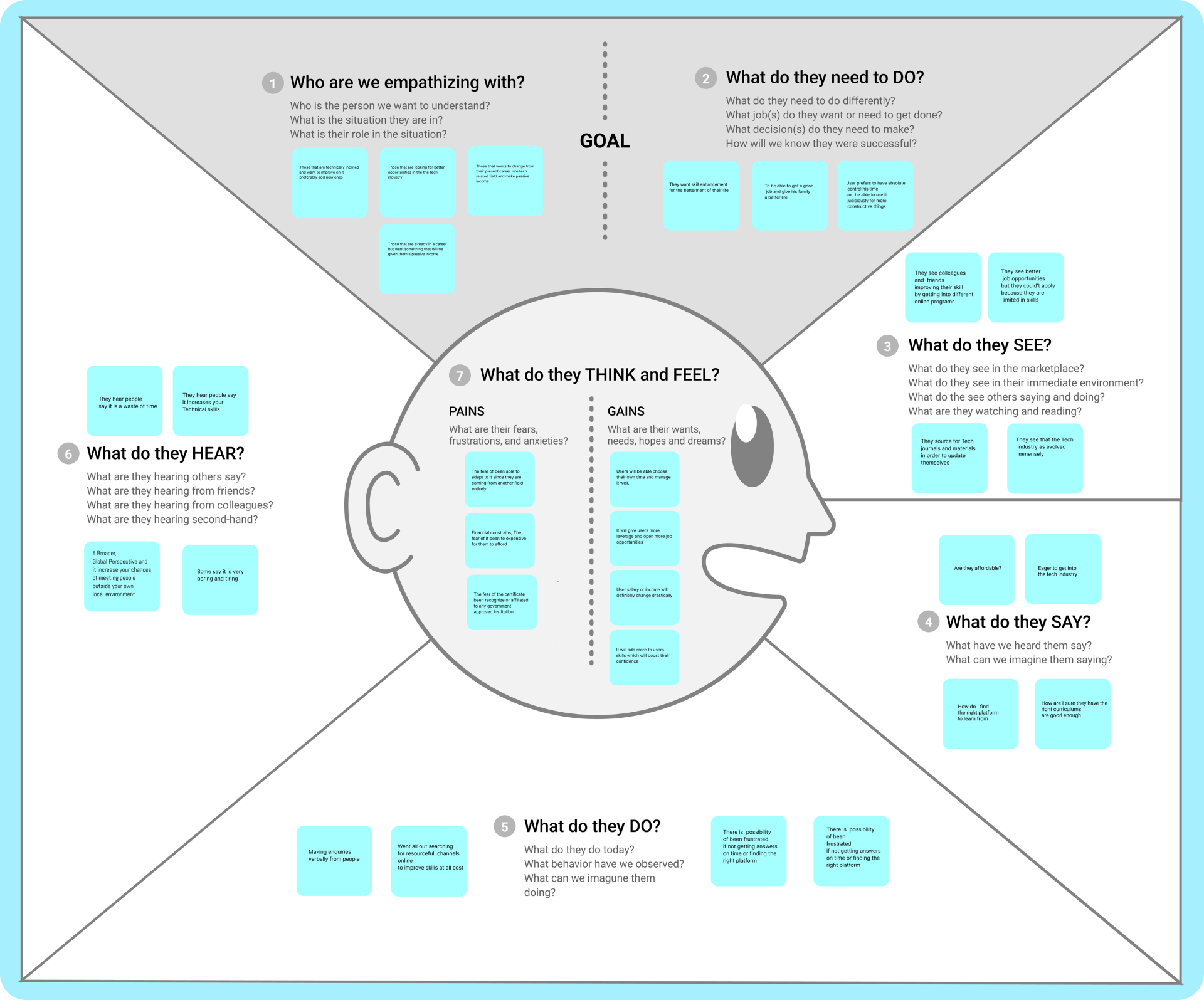
Going by all the information gathered from affinity map, which now lead me to the empathy map.
I was able to map out are those we empathizing with, which are basically the people in the Tech Industry and those who a planning to join the tech industry,what do they do, Want to improve themselves, for them to be able to live a better life, What do they hear, they hear divas kind of information both positive and negative, what do they think and feel, which is basically the gain and pain what do they do, What do they say etc.
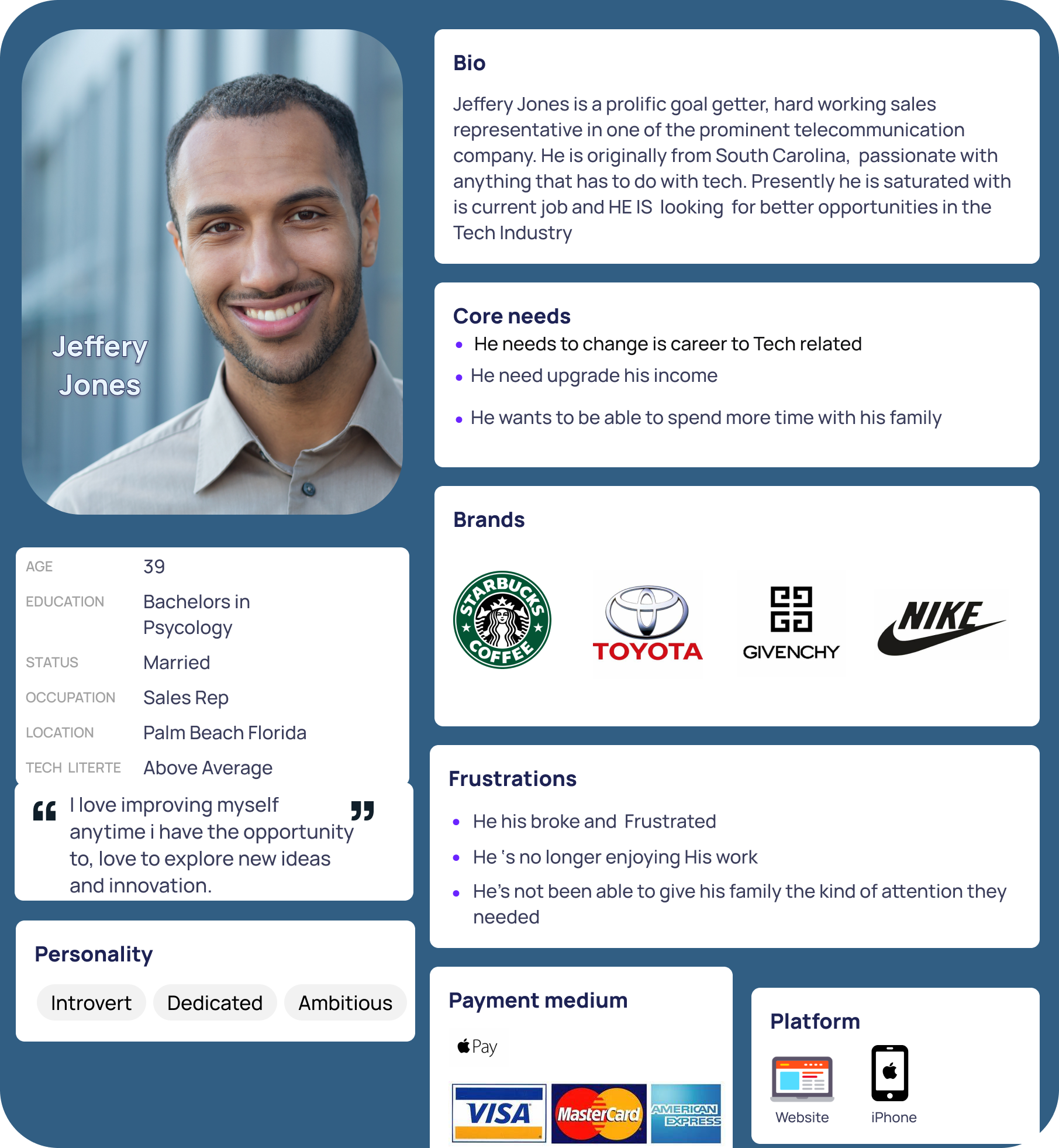
In order to empathize more with our user base I created “Jeffery Jones” as my user persona. Jeffery is a made up user that represents the data found in the research phase and puts all the characteristics and goals of our interviewees into a human we can relate to. This helps remind us who our user is and helps us get in their shoes so we can think more like them. A great tool for providing a user-centered solution.
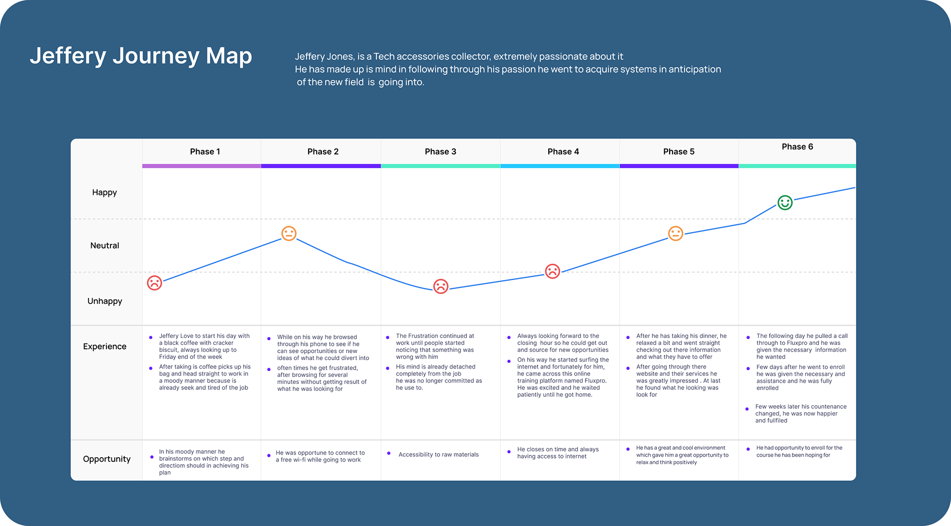
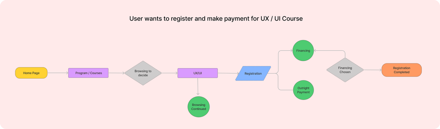
Jeffery goes through six stages in his tech industry transition. Each stage is associated with a specific mood and pain points. However, the lowest point in his mood occurs when he struggles to find the right e-learning platform for his tech training. This pain point highlights the need to improve the platform selection experience. By addressing this pain point, providing curated options, clear course details, and an intuitive search interface, we can enhance Jeffery's overall experience and support his successful transition into the tech industry.
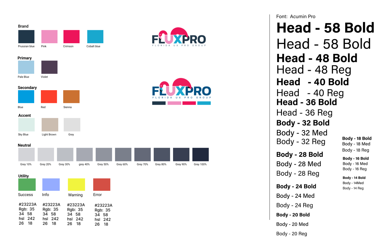
During my design process, I created a mood board to gather inspiration and select colors for the high-fidelity wireframes. Although the brand already had its own brand colors, I aimed to enhance and add a few features to them. Based on my user research, which indicated that many individuals are migrating to the tech field for better pay and improved quality of life, I explored various color options. After experimenting with different shades of blues,Crimson reds,Burnt Sienna, and Yellow ochre, I ultimately chose a combination of blues, Magenta, and Carton Brown, as shown in the mood board and style guide.
1 utilized the research results and stakeholder-providedbrand specifications to guide my design process. While the brand name and color were predetermined, I created the remaining application elements to align with the brand's identity. To maintain consistency, I adjusted the mood board to match the provided brand color. This approach ensured a cohesive design that met stakeholder requirements while incorporating necessary design elements for the application.
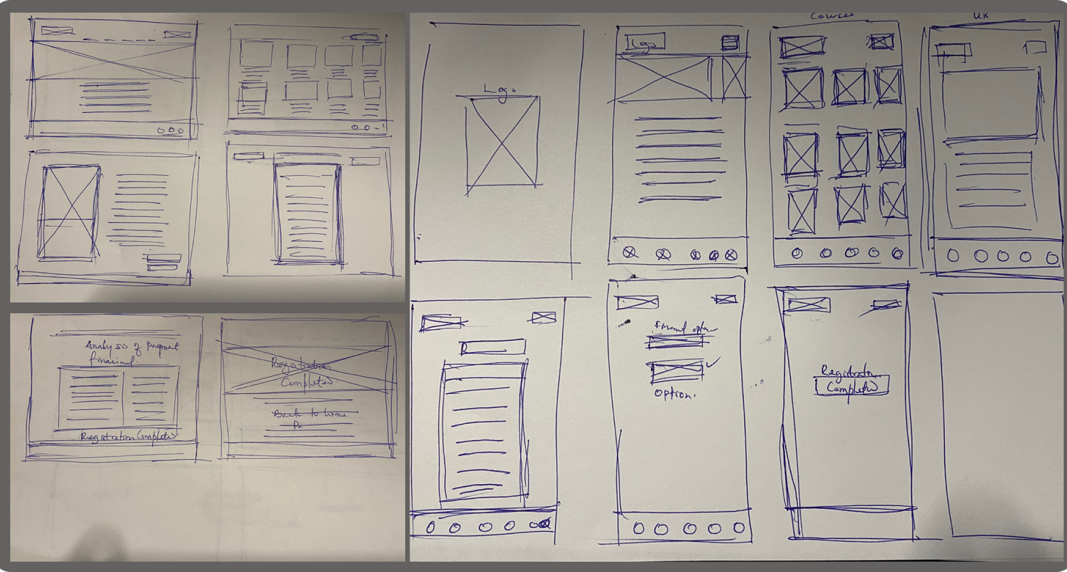
After carefully considering user feedback from the Lo-Fi testing, I transitioned to digitizing the design phase. The next step involved creating mid-fidelity wireframes that captured the refined user experience. By translating the feedback into tangible wireframes, I aimed to ensure a more accurate representation of the final design. This process allowed for a further iteration and improvement of the user interface before moving into the high-fidelity stage.
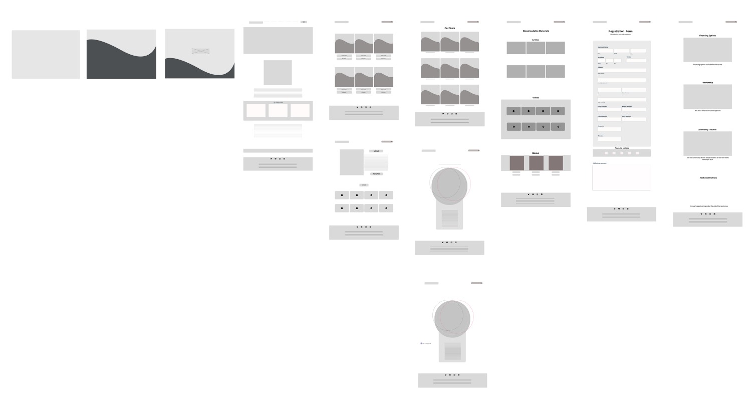
After finalizing the mid-fidelity wireframes, I advanced to developing a high-fidelity prototype. I maintained consistent interactions from the previous stages and adhered to the stakeholder's brand specifications. This ensured a cohesive and visually appealing user experience in the final prototype.
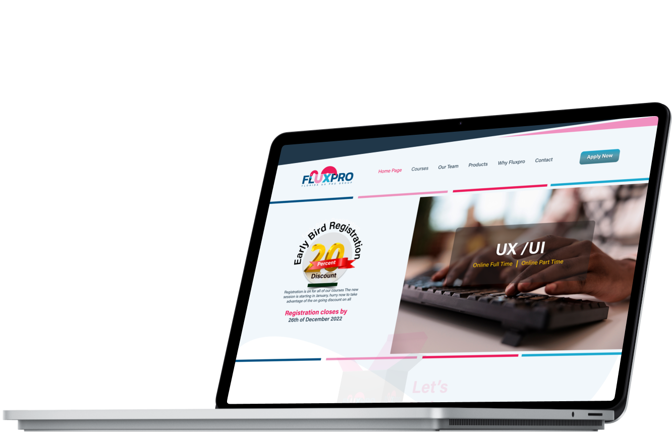
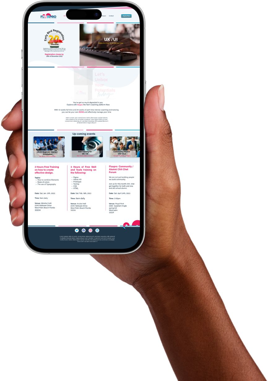
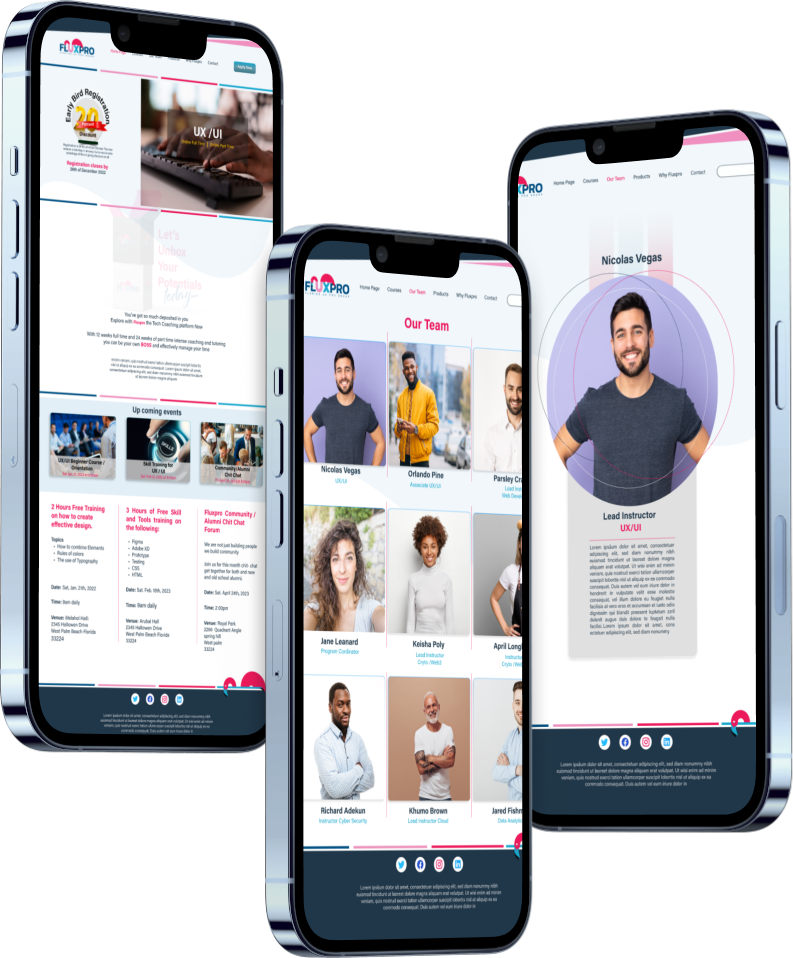
The Hi-Fi prototype of the Fluxpro E-learning Platform App is the culmination of research and usability testing conducted on the earlier Lo-Fi and Mid-Fi wireframes. The app offers career choice migration assistance,easy access to career coaching experts, free coaching materials, and a community of knowledgeable experts that users can join for free. The registration process provides flexibility, and users can download training materials. Additionally, the app offers accessibility to coaches' backgrounds for mentorship opportunities. the coaches background, for the purpose of mentorship.